LIVING ETC HOUSE TOURS 2019
The yearly pilgrimage from Manchester to the Living Etc House Tours in London was as much joy this year as any of the other three of these events I have graced. This year in the Peckham and Camberwell areas, six more home owners welcomed us into their beautiful, inspirational homes, full of personality and we came away brimming with a head full of ideas and excitement.
Here are my thoughts and notes of some of my favourite elements of each house, in the order that I saw them.
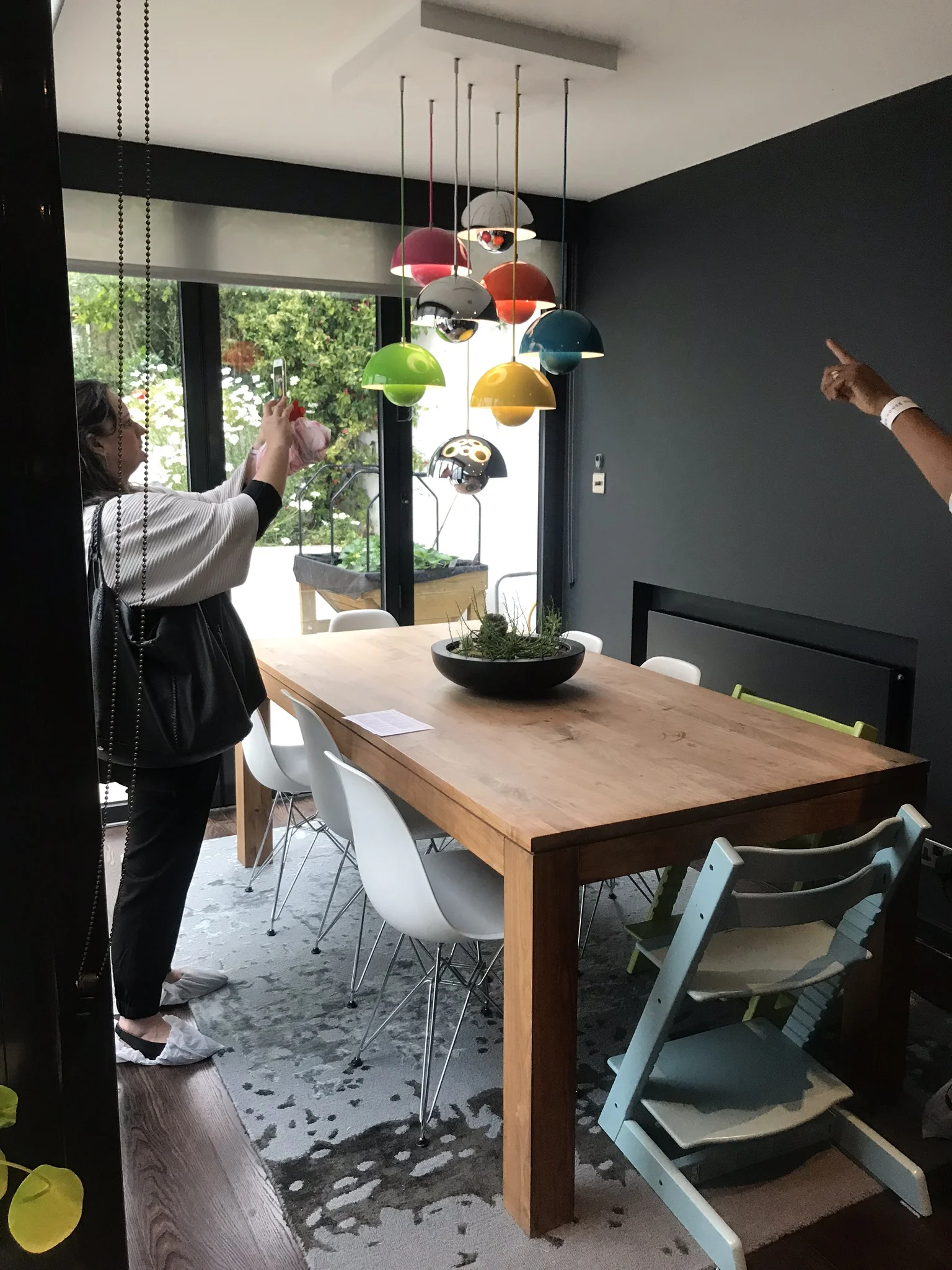
House D was the first house of the tour and it was a stunning start to the day. This large family home had floors that seemed to go on and on. Starting from ground floor level we saw a beautiful and fairly simplistic kitchen and dining area, which led on from a dark and cosy lounge area. The colourful lighting above the dining table said ‘family’ and ‘stylish’ and looked out onto the brick walled garden.
Ascending each floor we discovered a variety of stunning statement vintage items, from haberdasher’s cabinets, to laundry/bookcase units, filing cabinets and huge ornate gilt mirrors. It’s these curated pieces that were the highlight for me and I read that Julia Thompson at Frank Interiors designed and styled the rooms, whose signature style is all about marrying vintage with modern. I love vintage furniture, and as a daughter of tailors, these old haberdasher units hit me with a strong sense nostalgia and I love the way they are used in this home to feature beautiful items.
The master suite is practical as much as it is beautiful and the wall paneling gives me 5 star hotel suite vibes. The colour palette, furniture and fabrics work together harmoniously and the framed geisha print is something that I’ve been looking for, for my home. The bathroom floor tiles are a classic favourite of mine from Martin Moore Stone and give an edgy but calm feel to this sophisticated space.
The New York loft style boy’s bedroom is full of creative ideas. I loved the exposed brick and massive pegboard from Kreisdesign. The desk and shelving with the scaffold poles and planks is something I would have in my own home office, maybe with the scaffold painted a lovely pastel colour. I think children’s bedrooms is a place where you can really go wild and I loved seeing so much personality, fun and colour on show.
Now, the second house we went to see was actually on the same road in London, and I can’t tell you how different the houses were. House C belongs to artist and stylist Liza Giles, and architect Matt Giles - and this home was something of a show stopper to me, really sublime.
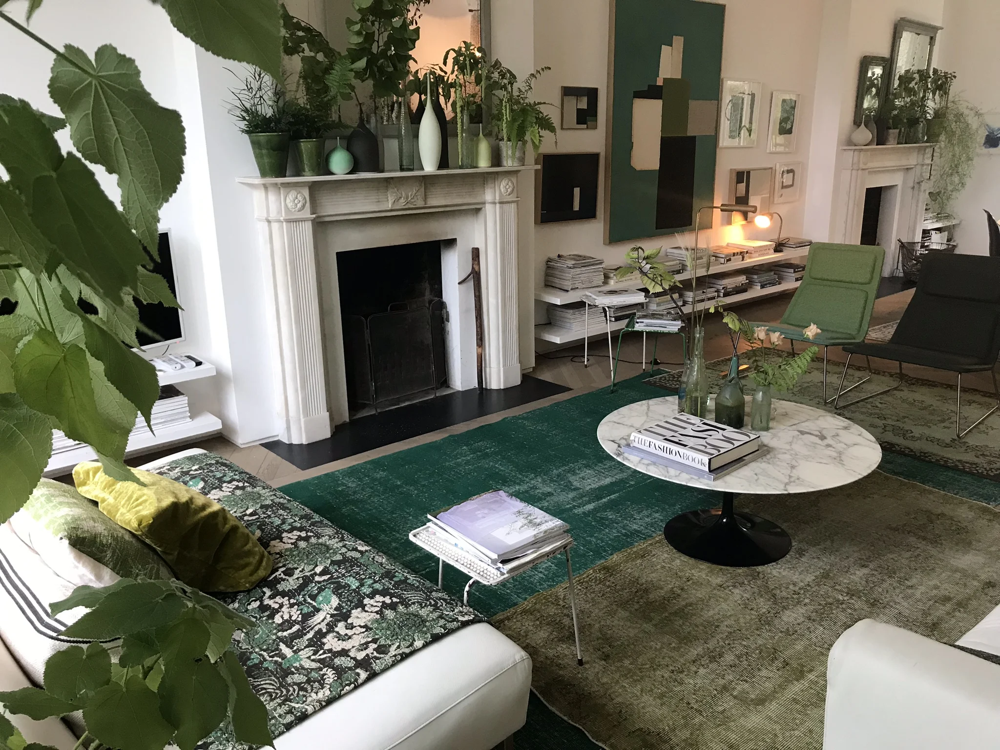
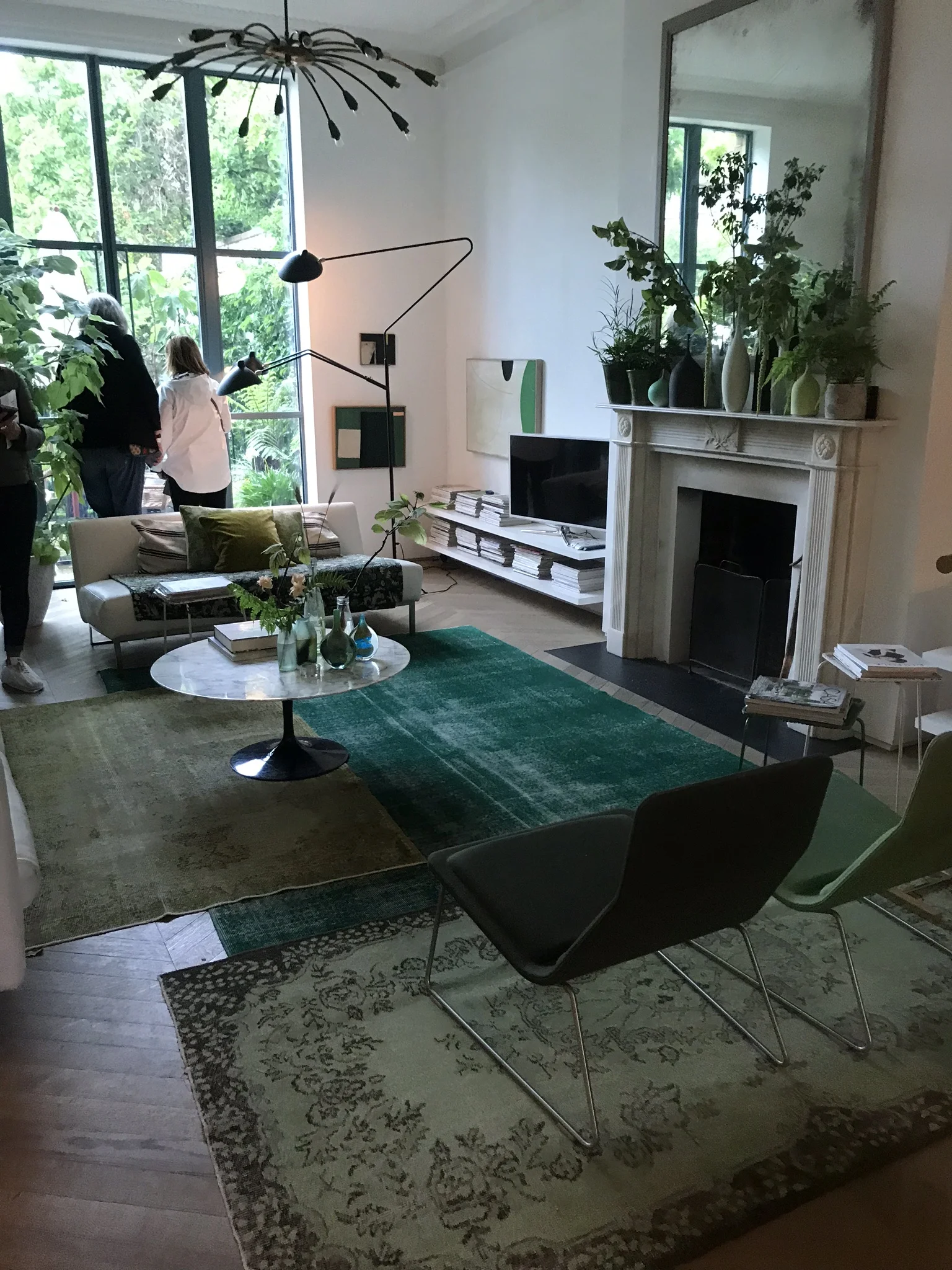
Liza’s art appears all around the home, and influences and informs the design and feel of the overall space. The sheer size and space, and feeling of utter freshness and flow was just so invigorating. The concept of white and green, light materials and finishes were maintained throughout the whole house and gave a real sense of relaxation and calm.
Strong green and white concept
I’m a HUGE lover of colour: brights, darks, pastels, all of them! I found it really interesting how a story of mainly just white and green grabbed me, and it surprised me how much it grabbed me! The art, the layers of rugs, accessories, abundance of plants, high door frames and ceilings, natural wood and wonderful tiles made it much more than just white and green, and there was something that was just so effortlessly cool with this house.
Even though I don’t think I would ever design this way in my own home, this interior has opened my mind and made me think differently. Because I love so many different styles, I generally like the idea of each room being very different - still an element of flow, but distinguished rooms. But this home is next level of flow and I really like the result is has.
The home reminded me how much I love the tile designs from Bert + May, pale wood parquet flooring and white marble. I love how collections have been displayed in the kitchen, glasses, books and photo frames running parallel to the shelf all at the same height – this looks really effective.
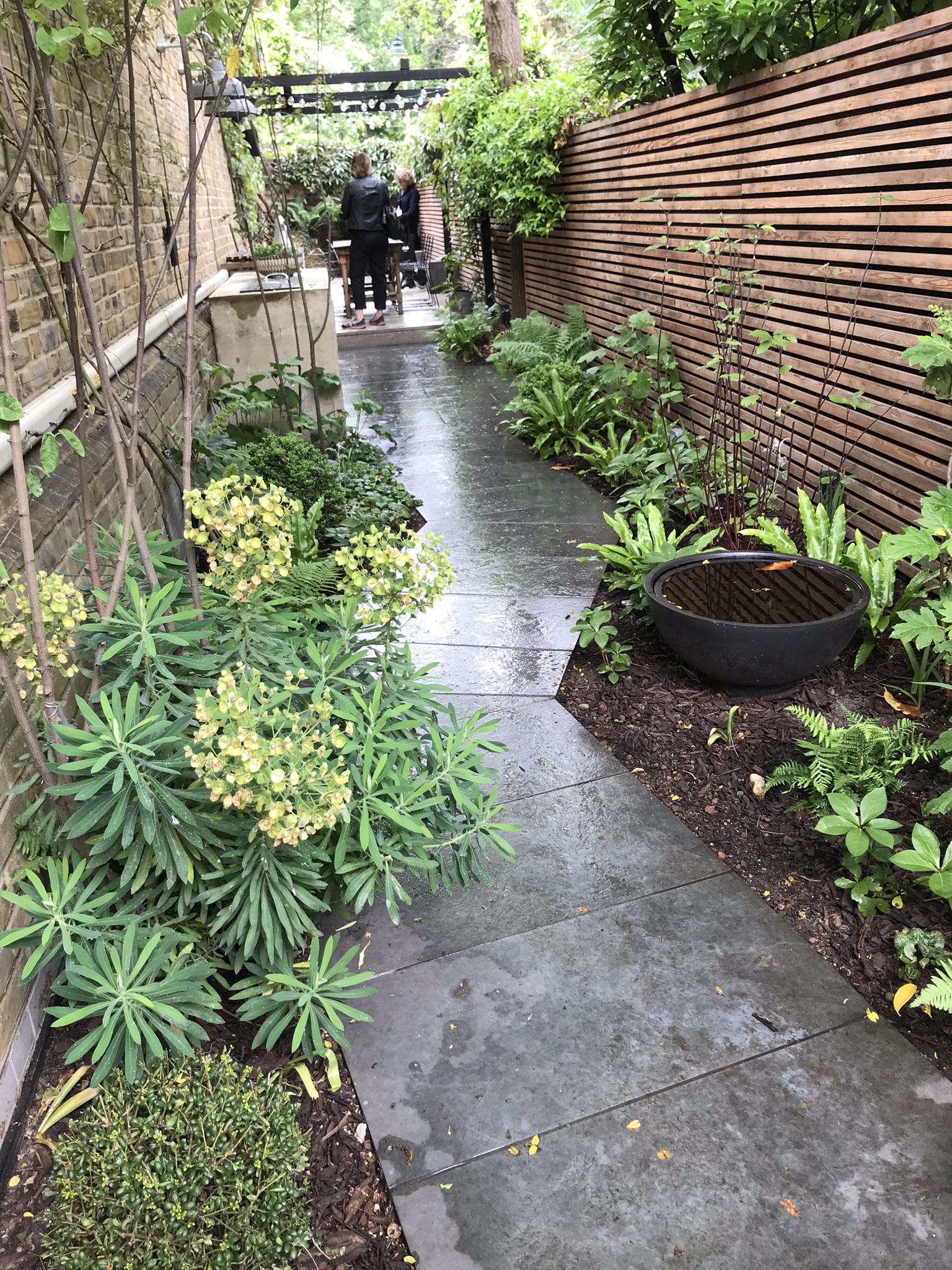
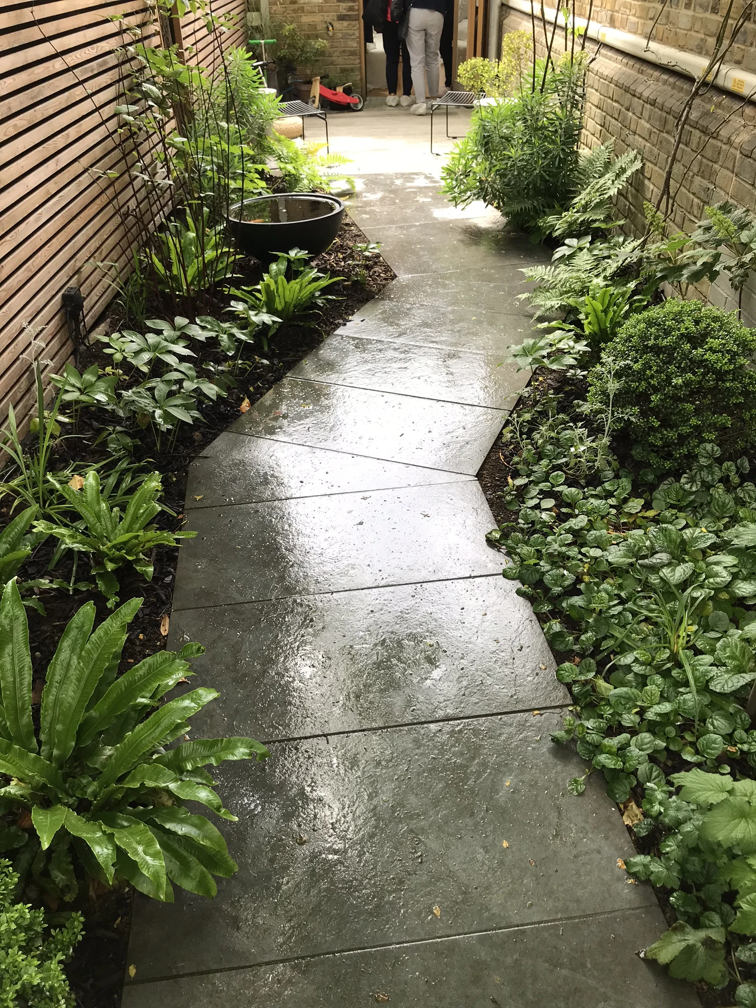
The garden continues the green theme, with lush bright green grass and perfectly shaped hedge rows. We visited on a very dull and rainy day but the home and garden remained luminous.
Highlights? Apart from everything I’ve already said (!) I enjoyed the mixture of classic designer furniture with vintage and high street. The hallway is light and breezy and wonderful, the master bedroom is spacious and divine and the dressing room is every girls dream, full height and generous and I loved the relaxed feel of the office space.
House A was the home of Julia Thompson, who runs Frank Interiors and also designed some of the rooms in House D. This is a home that really appeals to my innate dark and cosy nature and again is full of vintage treats, retro delights and sumptuous fabrics. This home had a real edge for me, I would happily retreat in the living area behind the kitchen, which opens up its doors to an enchanted layered garden area.
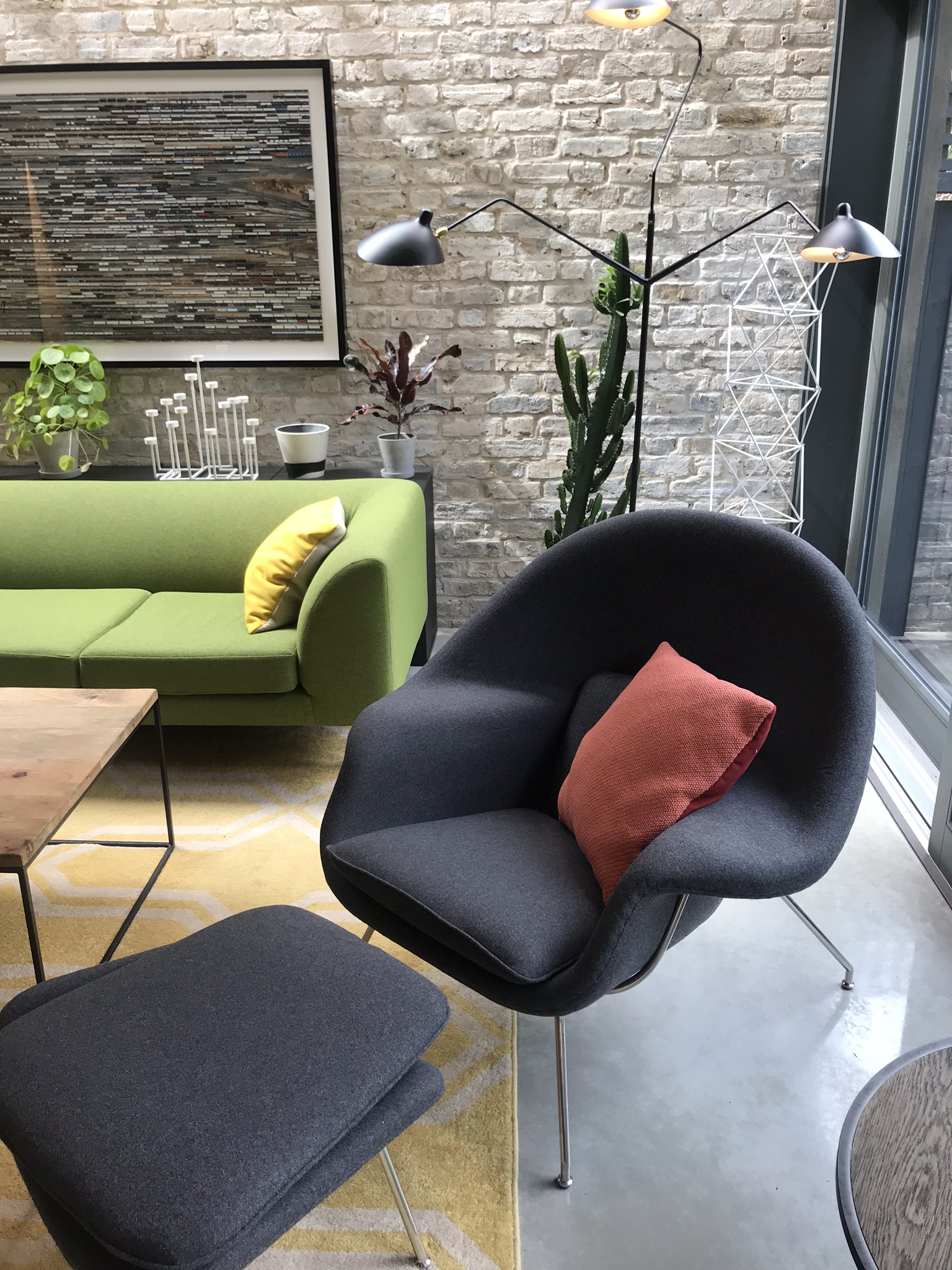
There were many highlights for me; the polished concrete floor of the family space, the retro furniture, flashes of orange, original (and oversized) posters and furniture with character and soul.
Probably my main highlight though, is the wow feature of the master bedroom; its three windows. For me this is the height of luxury for a bedroom, as well as having enough space to ‘swing a cat’ and fit a sofa! I can’t not mention the very cool and groovy ‘Undulate’ bathroom floor tiles from Alhambra tiles, they may be a little out of my price range but I love this flowing curvy pattern.
House B was very interesting as I found it to be altogether achievable, so it gave me lots of ideas for home extensions and styling. This home was deceptively large and full of interest.
The extension created a handsome family space which includes a sloped glass roof and picture window that beautifully frames the colour coming in from the garden. I love that the home owners have used the metal structural beam as a shelf, another surface to pack in more personality to exhibit special items into the space, as well as the shelf above the units in the kitchen.
Highlights were the mixture of mid-century furniture with bespoke and vintage, there is a landing at the top of the stairs which is basically a library space, the scheme is classic, understated and effective.
House E was designed by owner and interior designer Harriet Paterson who collaborated with architect John Eger. This was an interesting house for me to visit as it wouldn’t be my usual style, however the beautiful, natural, light home gave me some take-home things to think about.
You enter the home into a calm and restful seating and library area, which makes a fresh change to the usual living room, I thought. The living space is at the back of the house, behind the bespoke deVol kitchen. Again, this style of kitchen wouldn’t have been a go-to for me, but I love seeing the natural textures and materials next to each other, creating a very interesting and layered space. I love the look of the natural plastered (or could be resin) wall against the smooth white worktop and the beech cabinets, 2 of them being black which I love the contrast next to the pale beech.
It has a real Scandinavian vibe, I’m not sure if that’s deliberate but it’s a lovely, very cool, laid back vibe.
The oak stairwell is fluid and beautiful and seamlessly links the levels. The wood theme continues up into the office and the bedroom in the form of shelving, flooring and bespoke cabinetry. The feeling is of warmth, but also a coolness.
House F was a large, impressive, completely re-designed Edwardian terrace, designed by architect and co-owner David Money. This home was like being inside a grand design. Everything in here was bespoke, well thought out and efficient. The birch ply stairwell was not only beautiful and interesting, but housed the laundry area, bike store and entrance to the cellar.
The living room uses bricks salvaged from the demolition of the building’s interior and the garden was tranquil and charming.
Highlights for me were the ‘Goose Eye’ encaustic bathroom floor tiles by Marrakech Design, the bedroom with a mezzanine level for a gym, with book shelves built into the stairs that lead up to it, the bedroom that has its own living room, with a gold velvet curtain that closes the bedroom off when privacy is needed and the incredible landing, which had a part glass floor. This was real showstopper cool.
The more I look at the photos for this house the more I discover. The ground floor living, kitchen, dining room is so large and inclusive. There is so much space for everything; socialising, cooking, working, eating and general mulling about. I love the feel of it so much, it had such a grand and imposing feeling. The way the light reflects on the polished concrete floor makes it even lighter and brighter.
Oh, and my most favourite Domus ‘Puzzle’ tiles on the floor of the exterior entrance, what a way to enter!
Domus Puzzle tile

