How to sample & buy the right paint brand & colour
I’m a self confessed colour lover, and a total obsessive when it comes to selecting the right hue. But as much as I adore the process of selecting colours, choosing the exact paint can be a long, in-depth process, that a lot of us find quite overwhelming.
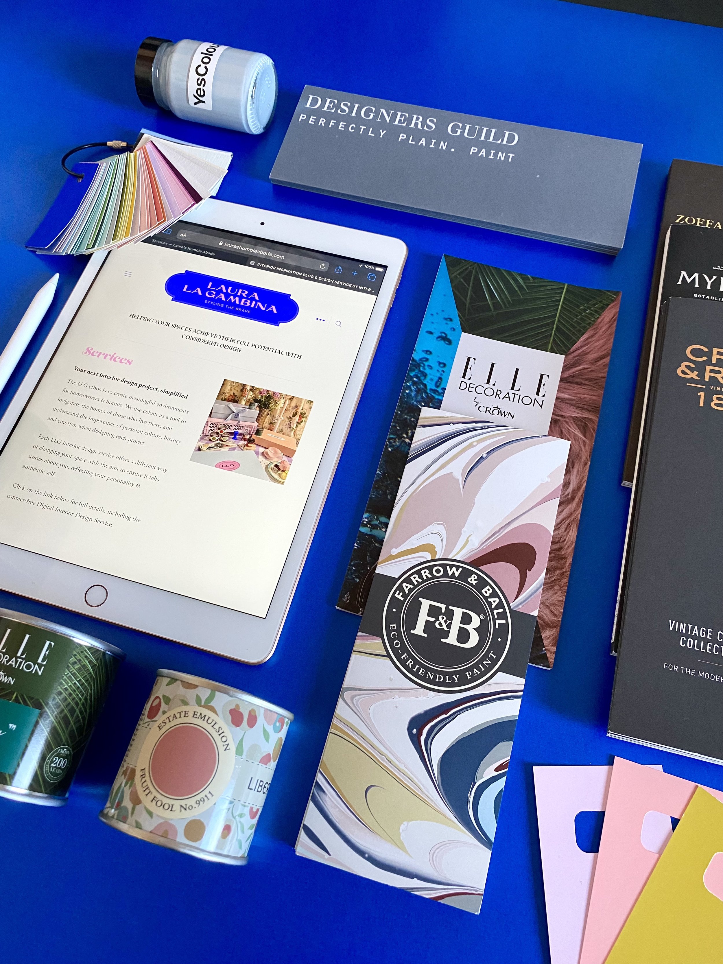
I have every colour card under the sun, Farrow & Ball, Little Greene, Mylands, Craig & Rose, Graham & Brown, Zoffany, Designers Guild, Crown, Valspar, Dulux… the list goes on and on. But which one should I pick up first? How do I select the perfect tone to match my scheme? How do I know how the colour is going to react to different lighting in the space?
These are some of the questions that have been put to me by clients and followers, which I aim to answer in this blog post. As a set designer and interior stylist I use and test colours on a daily basis, so I want to package up my experience in a handy guide for you, together with insider knowledge from a few industry experts. I’ll help you demystify the colour charts!
Where to start? Your Personal Style!
We each have one, so when it comes to choosing paint colour, we should channel it, and express who we are with our interior design and colour palette choices. What do we enjoy wearing? What are our favourite flowers? Are we minimalists or maximalists? What furniture are we drawn to? What feeling do we want to achieve in the room we’re decorating? These are just a a few questions that we can be asking ourselves, which will help steer us into a colour direction.
As a great starting point, and aid in helping you answer these questions, I would recommend reading the prequel to this blog post called: COLOUR PSYCHOLOGY & SEASONS: WHICH COLOUR PERSONALITY ARE YOU? My article delves into why we are intuitively drawn to the things we like, and helps us understand what season we are, i.e. spring, summer, autumn or winter. Believe me, this is a game changer and really helps when choosing paint!
First Impressions count
When you pick up a colour card, you will instinctively know if the palette is for you or not. As an autumn personality, I’m drawn to saturated, warm colours. So if I see a chart that’s full of neutrals, beiges, greys or even too many pastels, I know that this brand isn’t speaking my language.
I’ve heard some of my friends and clients comment that certain colour cards look ‘muddy’ to them, or conversely, too bold and bright, and this is because we belong to different seasons. It’s a good idea then to place that colour chart down, and move onto the next one, one that speaks to your inner season personality straight away.
Valspar paint chips
A handy tip
If you have an idea of the colours you’re interested in, the ones that you think will work with your scheme, flick through colour charts to see if those colours jump out at you, in the same way that you would when flicking through a book or magazine, deciding if you’re going to buy it. If you can’t see colours that are going to work, don’t try to make them fit - again, place the card down and move on.
Research & Brand Values
Once you have unveiled your colour personality, interior scheming will become so much easier, and when you understand why you choose what you do, the process becomes natural. You will then select palettes that match your true identity, supporting you emotionally and therefore giving your surroundings a deeper meaning (which is what LLG is all about.)
You will begin to look at paint charts with greater confidence, and you’ll understand which tones work with your overall idea for the space, and how you want to feel. Your feelings may go beyond the physical space, you may become more interested in the paint companies out there, and what they can offer you in terms of brand values, eco credentials, quality and service.
The reasons that my go-to paint companies became just that, are because their values are synonymous to my own, and I have learned this through carrying out LOTS of research, and continuous paint testing. I like to understand the methods that paint brands are using and what goes into their process. This is a great starting point in selecting the right brand for you. Whether you want your paint to have low VOCs, or a paint colour that harps back to a particular era, you’ll find all of this information on the brand’s websites and social pages.
As an autumn personality, I love strong, rich, flamboyant colour and I’m big on history and quality craftsmanship. This explains why I’m drawn to brands with heritage, those that are steeped with meaning and history, that employ the artisanal, traditional methods they started out with, whilst continually developing and moving with the times. This is why I’m drawn to paints brands like Farrow & Ball, Craig & Rose and Little Greene.
A brief history lesson
Little Greene, is a British paint company that dates back to 1773 in Manchester, it’s the official parter of the National Trust, and Farrow and Ball started out in 1946, when local pioneers John Farrow and Richard Ball met after the end of the second world war. Craig & Rose was founded by two young Scottish entrepreneurs James Craig & Hugh Rose in 1829, hence their main collection aptly named ‘1829’. Craig & Rose created paint for many notable historical buildings including St Paul’s Cathedral and palaces around the world. Today, their 1829 paint collection offers these period colours, in finishes for the modern home, and they offer a lovely inky, moody range with their Abigail Ahern collection.
Maybe it’s prestige and stories like these that draw you to a brand?
But its not just about the colour
You’ll find that the more colours and brands that you test, the more you’ll realise that is not just about choosing the right colour.
Colour, brand values, heritage and reputation alone are not enough to judge the quality of the physical paint. The paint’s primary function is to coat a wall, so consider these points:
Quality - will it last for years, is it easy to apply?
Performance - does it withstand wear and tear, can I scrub it?
Coverage - does this paint require more than 2 coats?
Pigmentation - how saturated do I want the colour to be?
Environmentally friendly - is the paint water-based with low VOCs (Volatile Organic Compounds), can I wash my brushes in the sink?
Value for money - this depends on the importance of each of the above to you, vs your budget.
The only way we can accurately rate each of the above is to stock up on those tester pots to find out which colours are right for your space, which paint applies the best, and the quality of the finish when it’s on the wall.
Time to watch the paint dry
We know this already, but here’s visual reminder that wet paint is a different shade to when its dry, it dries darker. Don’t be put off by a paint colour when it’s first applied.
To make informed decisions, you need to get sampling….
Farrow & Ball Brinjal paint: dry on the left side vs wet on the right
How I paint samples
What a colour looks like on Instagram is not how it’s going to look in your home. That room is different to your room, the light will be different, it could face a different orientation completely and no doubt, filters, or some photo editing will have been applied.
If you like the colour then OK, buy a tester pot and sample it in your space as per these steps.
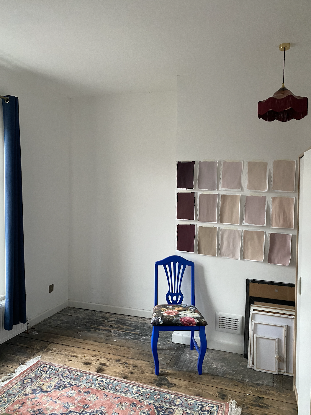
Paint good quality thick paper size A4 or bigger with 2 coats of paint.
Label immediately with paint and company name (or you WILL forget what’s what at a later date when in a sea of paper samples!)
This piece of paper is now mobile (as opposed to painting directly onto a wall) which allows you to move that sample around the room.
Evaluate the sample in direct sunlight, on ‘the main’ wall, and in a dark corner. This is a really important step as you’ll notice that the colour will look very different in all 3 areas, depending on the amount of light in each area. I get a lot of questions about how paint changes dependent on the light it’s in - this is how to check that you like how the shade looks in different lighting.
Once you’ve chosen your colour, you have this painted paper sample to refer to for next time which can of course be tested in other rooms… an immortal paint sample.
Paint samples galore
Colour matching is risky business
Once I’ve spent say £30/£40 on tester pots (it soon adds up!) agonised over the various tones, and finally picked the perfect shade, it’s counter-productive to colour match at this point. Taking the chance that a different paint company will match to the exact shade of another is risky, and also not entirely possible as different paint companies use different ingredients and compounds.
In my experience (I’ve colour matched a lot in my day job) - it never matches! Sometimes it’s close, but other times it can be very different, its a gamble. My advice is that if you’re colour matching because of budget, first pick that brands that are affordable for you, and sample the shades from that brand. Then you won’t need to colour match once you’ve picked your colour.
Below is my Farrow & Ball Brinjal sample against the actual painted doors… believe it or not, an exact colour match! Reason to believe in the paint sample process!
Farrow & Ball Brinjal
But, how many samples is too many? I asked an Instagram influencer…
If you love colour, and don’t already follow Jess at @thehousethatcolourbuilt - you need to! Her home is a kaleidoscopic dreamland, and provides constant inspiration on how to use colour confidently. When I asked Jess how many tester pots she tried in her home before she found the perfect shade, she told me that is depended on the colour. With their living room and bedroom, they only picked from 2 samples, but with the hallway they went through tonnes of different greens. ‘Sometimes I just find the exact shade right away, and sometimes its trial and error.’
Living Room at The House That Colour Built
So buying many paint tester posts is normal, everybody, even the pros and Insta influencers have to do this to get it right because they know it all depends how the colour looks in your space when it’s dry, and how it sits with the rest of the scheme.
Should you believe the hype? I asked another expert.
Farrow & Ball are known for their use of natural compounds and being kind to the environment, creating paint which has minimal or low VOCs, are water based, and the pigments that give it the rich colour are responsibly sourced.
Their USP is ‘The Unique Look’ which basically means their paint will magically morph and change depending on the light throughout the day. Here’s what they say:
“From passing clouds and the dipping sun to the glow of bulbs and the flicker of a fire, our paint colours gently shift in light and shade, bringing added complexity to your decorative scheme.
This is because our immersive paint colours are blended with a balance of rich pigments and generous amounts of light-reflecting titanium dioxide, meaning that, as the day goes on, the varying undertones in every hue can become more or less prominent.”
— Farrow & Ball
I caught up with Richard Airey, a Colour Consultant at Farrow & Ball, Manchester, asking him some questions about the brand:
Image via @aireyhound, Farrow & Ball Colour Consultant
How do you recommend a starting point to a flummoxed and overwhelmed customer?
Richard - ‘Take inspiration from your taste! What you like, what colours you wear, look in your wardrobe… what furniture and accessories will it be teamed with, and what do you actually want to achieve.’ He says, ‘most importantly don’t be to led by trends!’
How many sample pots does a customer normally buy before they find the right shade?
Richard - ‘I would always recommend at least 3 sample pots, and all different. There’s no point picking 3 slightly different greys, Pick a grey, pick another neutral and pick a colour - and then we can work from there.’
What do you love so much about the Farrow and Ball brand?
Richard - ‘I love the history of the brand, the unique colours and that we don’t have thousands of choice like other companies. I like how rich and pigmented the colours are and how you can make a colour change when just paring it with something unexpected.’
Mixing it up, designer style
Designer paint charts are edited in a way that all colours work together tonally. Picking shades from different companies and charts means that you have to work that out, and test them for yourself to find the right tonal balance. But in the same way that we’re not destined to love all the songs on an album, it’s fine to only be drawn to one or two colours from a paint chart that resonate with us, we don’t have to like all of them.
So even though we’re putting that chart down for now, make a note of the colours you like, or even cut them out, making sure that you write the name of the colour and the manufacturer on the back (other wise it gets very confusing!)
I know this has been a beast of a post, but hopefully a really useful, practical one, arming you with information that can help you decide which is the right paint colour and brand for you.
Please do get in touch if you have a project that you’d like to discuss.


