The 'Physical' Interior Trends of 2021
2020 just may have cancelled the ‘trend’ as we know it, and for many months to come. But as the very meaning of the word trend is ‘a general direction in which something is developing or changing’, I think there’s a whole new way of looking at the direction of things, in general.
I think if you have a strong sense of style and know what you like, trends don’t tend to impact too much on your decision making, but what they do tend to do, is make those certain things that you’ve always loved, ubiquitous, meaning a larger product offering of the ‘trend’ in question.
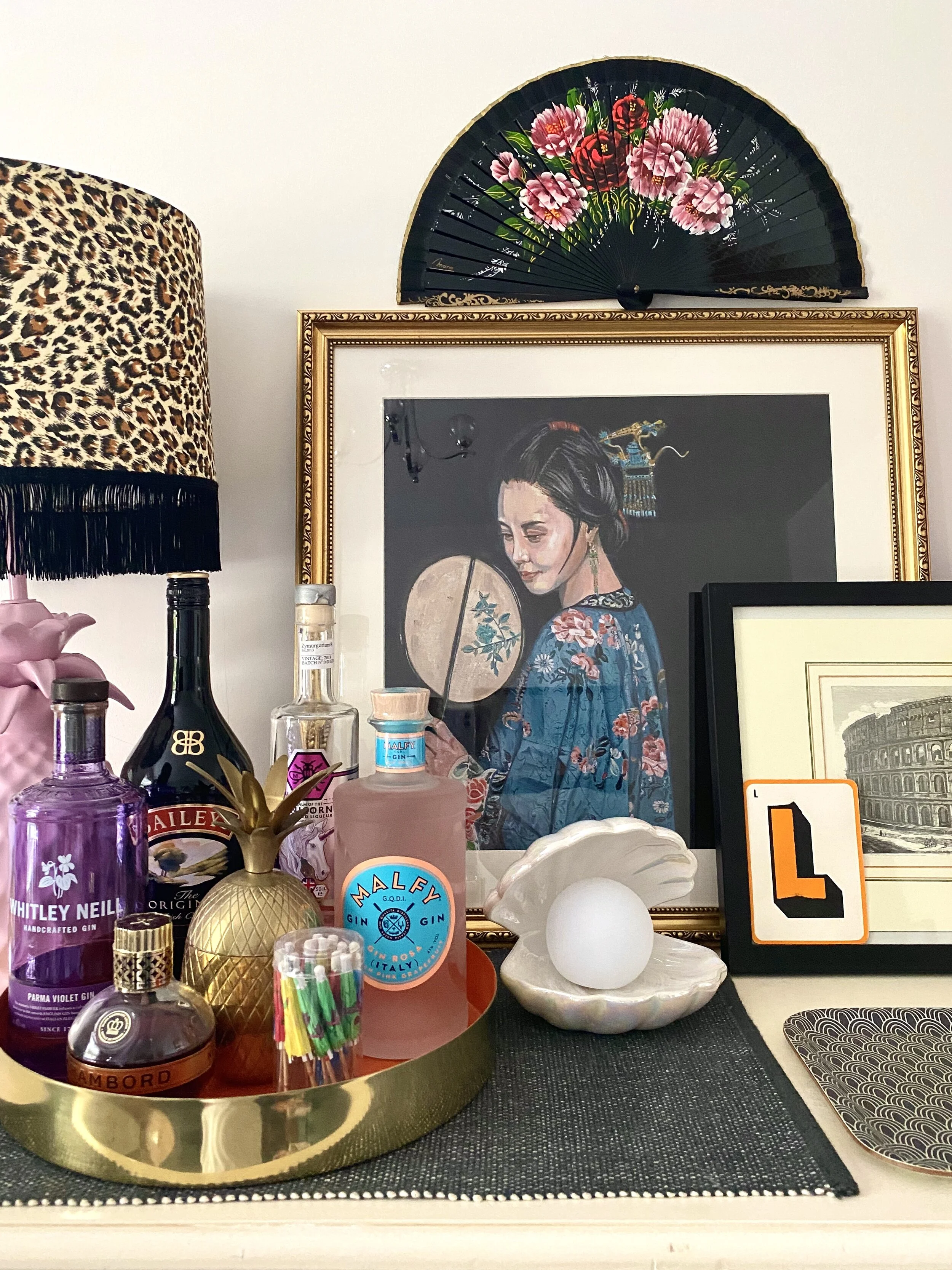
For example, last year we saw the micro trend for all things shells really take off, and before we knew it, those clamshell lamps with the glowing pearl inside were much easier to find, for me included (take a look at my blog about the shell trend here.) The same thing happened with the popularisation of velvet, Japandi inspired products and the love for dried flowers. A wider product offering means more competition between retailers and designers, which lowers prices, therefore making that certain thing you’ve always loved affordable and easier to purchase, when it may have initially been niche and expensive.
The clamshell lamp in my home
I think that the virus, the lockdowns and therefore working from home has shifted our focus in a major way, and in my view, trends are now not only physical, but emotional as a result of we’ve endured. We know that spending much more time at home has resulted us re-evaluating elements of our physical four walls, meaning our feelings towards home, have also changed.
I’m going to split this article into two, this one will concentrate on what I’m calling ’physical trends’, so, trends as we know them. This is what I’m seeing coming through via the magazines I read, the designers I follow and the research I’ve undertaken using forecasting tools like WGSN. Some of them are micro-trends, but influential nevertheless. The article to follow, will be more about the emotional trends, that have been heightened since the wave of the Covid pandemic.
Wall panelling
Although this trend started a good couple of years ago, it really took off when those of us had furlough/lockdown time at home, to actually find the mental, as well as physical capacity to apply wall panelling. 2020 gave rise to DIY projects galore, and a task like this, which before a national lockdown may have seemed like an arduous one, particularly for intricate mouldings and multiple rooms, seemed to have exploded on Instagram.
Take a look at Melanie’s fabulous Instagram page here
Some of my favourite examples include the bedroom of Melanie Lissack. Personally I love everything Melanie does, and I highly recommend her Instagram page and her blog for daily inspiration. If you’re planning on adding Parisian style wall panelling to your home, take a look at her step by step process here, which I will be following to the letter when the time comes for me to panel my walls!
I also love what The House That Black Built and The House That Colour Built (two entirely different accounts based on their colour palettes, incase you couldn’t tell by their account names) have done to their home, similar principles, in palettes of a stark contrast.
I love the look of wall panelling and moulding because I’m drawn to traditional features, and if your home lacks them, adding wall panelling adds impact and a real sense of grandiose.
Very intricate wood panelling at The House Of Black Built
Love the use of this pink pastel colour below the picture rail - see more of this home over at The House That Colour Built
Marble
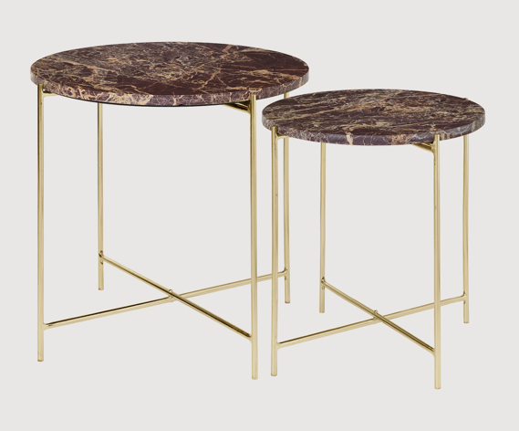
Marble is now a mainstream trend; ’12.9% of the WGSN user base on social media posted about marble in 2020 on a monthly basis, consistent over the past three years’. Classic, well-known styles such as black and white marble are steadily trending within the mass market, and now we’re seeing the ‘Innovator’ segment drive growth in coloured marble.
WGSN have determined that the main driver behind our love for marble is due to an increase in our interest for durable, natural materials. We are veering towards products that will give us long-term luxury, and we’re conscious of where these items and materials are coming from. I think that this research is really key, and I will talk more about this within my next post, that I’m calling ‘emotional trends.’
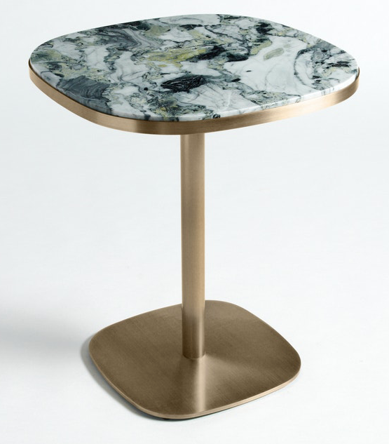
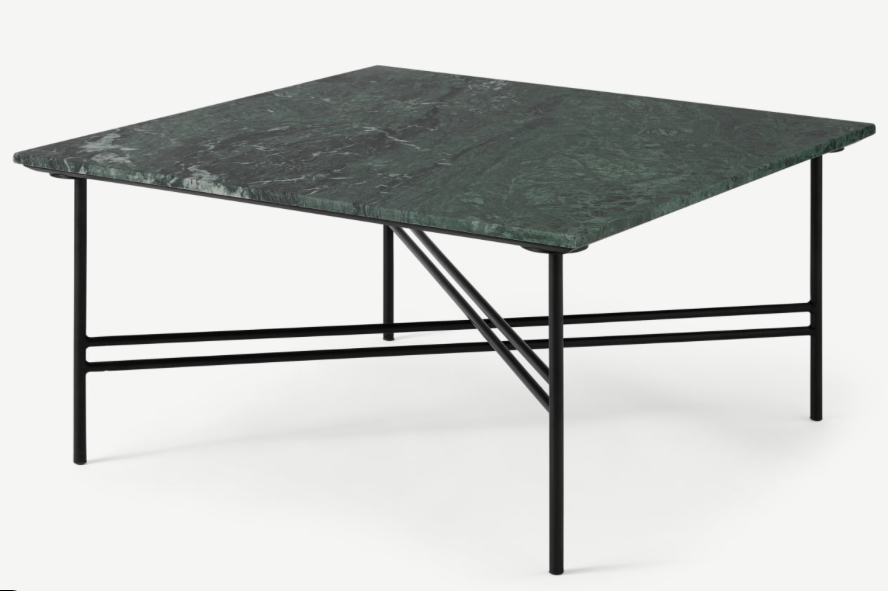
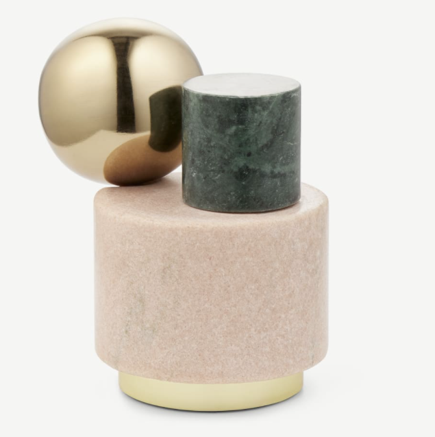
The top categories for marble within the mass, commercial markets include; bathroom, kitchen, tables, carrara marble and white marble, whereas within the growth category, i.e. coloured marble, shows searches particularly for warm tones like rose, yellow and emerald greens, as well as decorative items like vases and dinner sets.
Here are some of my favourite marble pieces for the home, click on the images to shop if you wish:
Improving storage solutions
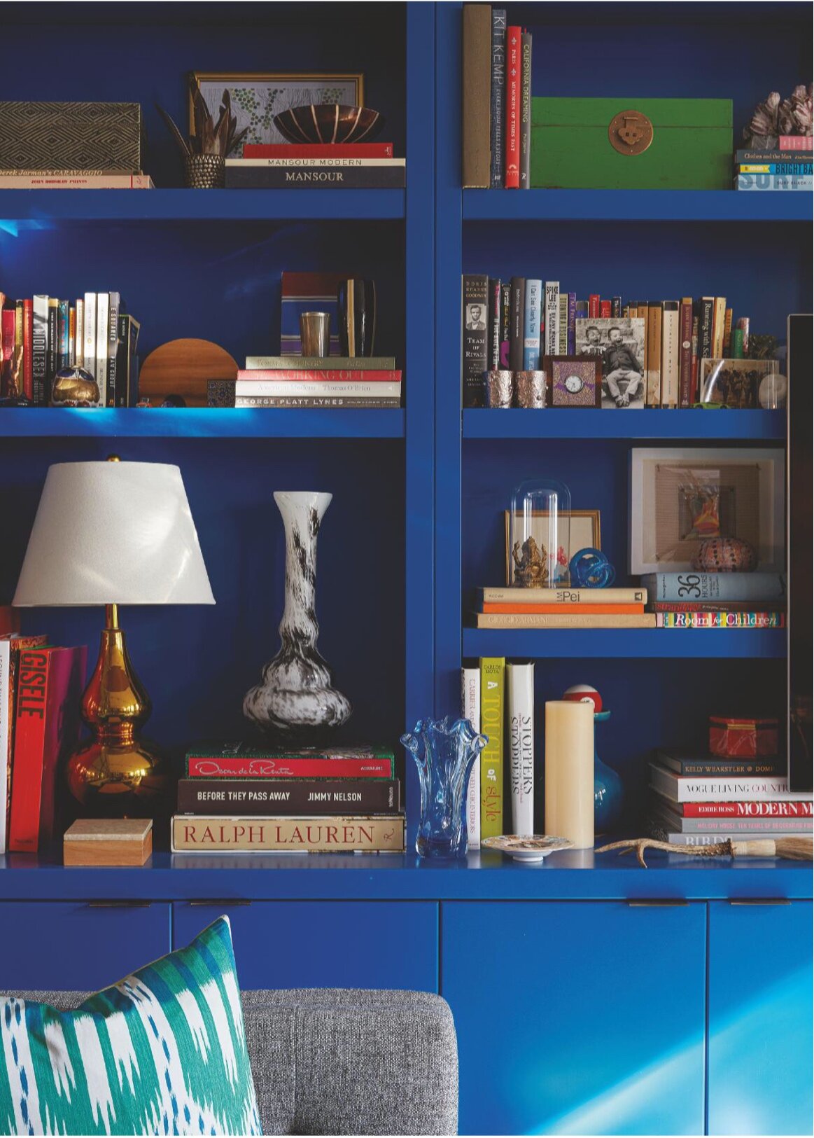
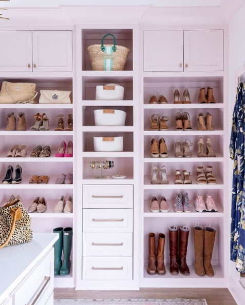
Now that a high percentage of us are at home, stuff everywhere doesn’t really cut it does it? It doesn’t really provide that calm, productive working space that our Insta friends seem to have. Investing in harder-working storage; whether it be a divan bed, an ottoman, a well planned office or indeed, bespoke built in shelves and cupboards, our online searches for such solutions are on the up.
Quick tip: before you commit, remember to actually take stock of what you have to ensure you are buying smart, rather than thinking you are. A pretty lidded velvet footstool that holds approximately one blanket if you fold it really small it not classed as ‘improving your storage solutions’ - sadly. No point buying a three shelf bookcase if you have hundreds of books and magazines piled up on the floor, sound like anyone you know? Store well, for an uncluttered mind. Here are some ideas that I love:
This bold blue is ‘Ol Blue Eyes by Benjamin Moor in the home of designer Rayman Boozer via Living Etc Magazine February 2021 issue. For me, bespoke storage doesn’t get better than this: BOLD and beautiful.
This custom storage designed by Lisa Dawson for her home was planned out using grid paper and pen. Literally draw out what you need. Each section not only includes items to ‘store’ but also to display.
A dream for most of us who appreciate our wardrobe, this shelving is painted in Farrow & Ball’s perfect Calamine shade.
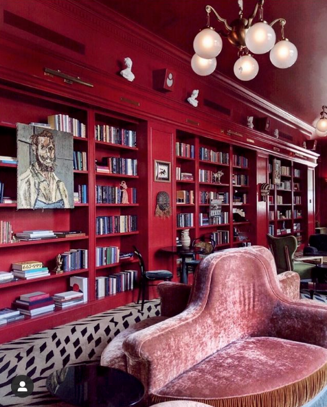
And of course I’m going to bring it back to bold and saturated. Please excuse me while I salivate over this work via Unique Spaces
Hand crafted
Tough times often lead to new ways of thinking, and changes what and how we value things. The developments of 2020 have encouraged a shift of focus regarding what we feel are important purchases for the home. We’ve noticed that we might not need as much ’stuff’ as we think. We’ve realised that what we do buy, we want that to be high quality, hand crafted, artisan, long-lasting and altogether evoke a feeling of luxury.
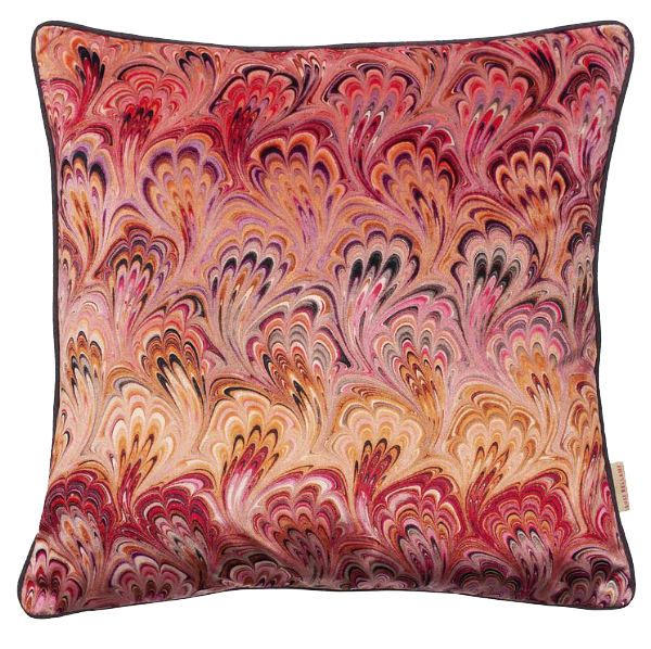
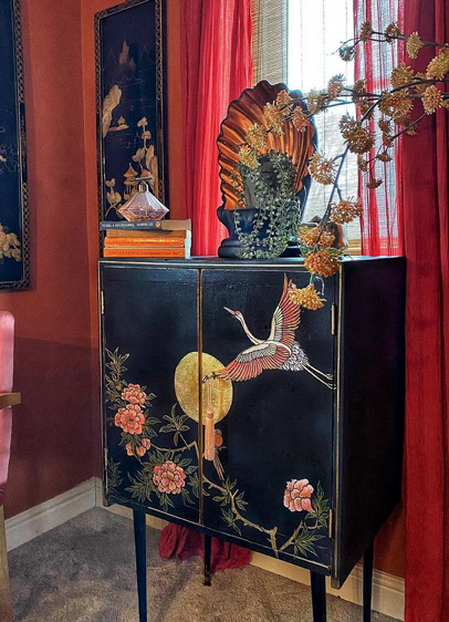
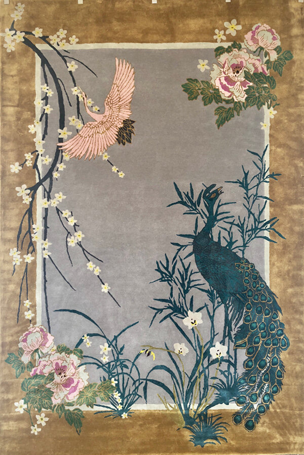
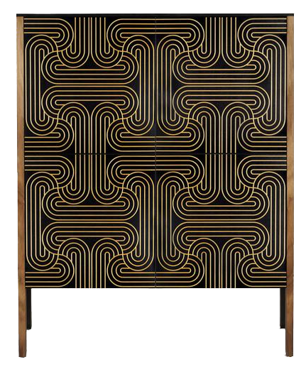
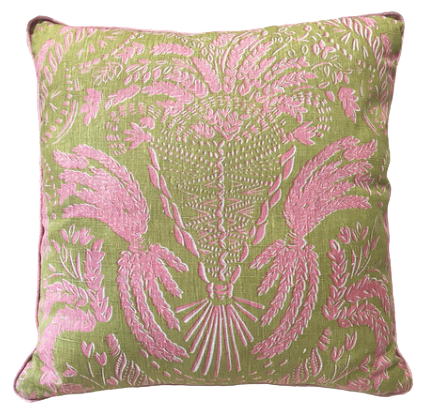
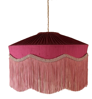
I have a bank of go-to designers and artists for all interior items including cushions, fabric, wallpaper, rugs and furniture and I implore you to check out some of my absolute favourites: Susi Bellamy, Beauvamp, Wendy Morrison, Beki Bright, Cutts & Sons and CoucouManou, for hand-made wares that involve traditional techniques and meticulous attention to detail.
I’ve also included the work of Sarah Parmenter aka relovedmcr. The cabinet I've included within the carousel below shows a piece that was commissioned by one of my clients based on the bathroom design I created for her family home. Sarah used a mixture of three stencils, as well as free hand-painting to create this piece, and isn’t it stunning. Who would not want a completely bespoke hand-painted item such as this in their home? I can’t tell you how excited I am to see the whole scheme to come together (which I’ll keep you posted on as soon as the restrictions are eased enough, to be allowed to take pictures of the finished room.) Click on each image to be transported to the designers’ websites.
Pillars & Architectural Details
The likes of Luke Edward Hall and Duncan Campbell have popularised the English Heritage look amongst the youth. I therefore predict that pillars, busts and architectural details of interest will become synonymous with Grand-millennial style, which is essentially modern-day design, co-existing with hand-me-downs and inherited pieces, alongside second-hand vintage pieces and reclaimed furniture (so very much a anything goes kind of approach.)
Millennials are embracing dated, previously faux-pas items into their modern homes, providing a fresh take on ‘a look’ or item they’ve known all their lives. Think, the Trafford Centre, (bear with me here) but (a lot) more authentic, with a kitsch twist, teamed with a liberal approach to design, with a diverse mix of eras, cultures and ‘trends’ mixed in for good measure.
The Simply Fantastic interior of Luke Edward Hall
Maybe I can describe this better in pictures? See above… note the pink pillar (which is apparently from a window display at a wedding supply company, then painted pink - what a find!) Yes, in other interior schemes this might look slightly mad, but teamed with the heritage yellow wall colour, William Morris(esque), if not the real thing (I can’t zoom in enough to know) curtain, wall sconces and grandiose furniture that could easily be inherited pieces, and second hand items - there we have it, the perfect lesson in Grand-millennial styling, using a pillar
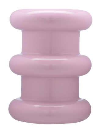
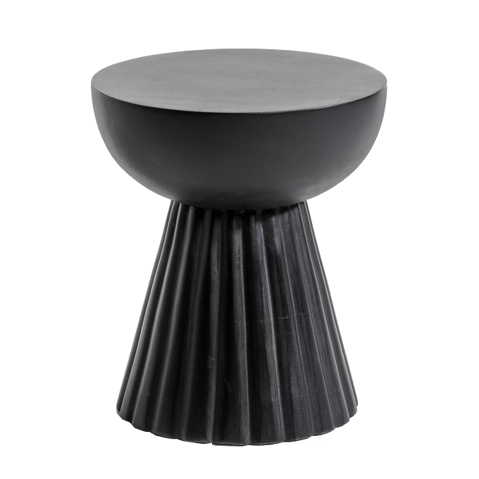
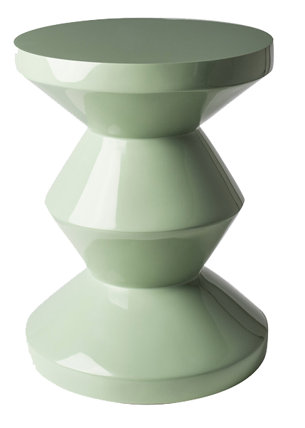
Personally, I love a sculptural piece, and I’m drawn to the ones that involve the juxtaposed mix of the Roman Empire look (so casual), with modern-day materials, textures and colours. I can imagine any of these column inspired pieces in a colourful space that’s very personally styled, next to a velvet sink in sofa, piled with beautiful books. See below for what I mean, and browse at your leisure by clicking on each image.
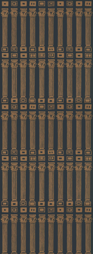
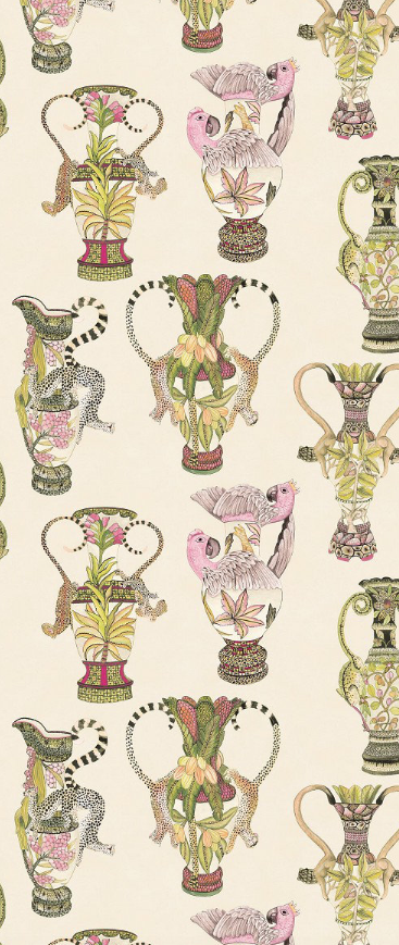
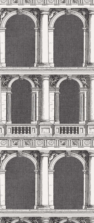
There are a number of wallpapers that have caught my eye recently and they fall nicely into this category. If you’d like to add magnificent, palatial designs into your home, look no further. Just add a candelabra, a gilt bust and elaborate floral arrangement. Click on each wallpaper to find out more.
Gingham
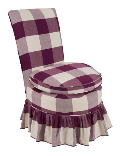
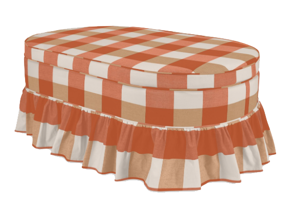
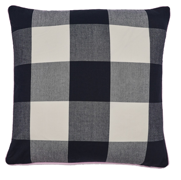
A lively pop of this celebrated check fabric will add just the right amount of joyous nostalgia to your home. Get ready to be transported to a picnic situation, your nana’s house or your favourite Italian restaurant, or is that just me? Either way, the oversized version of this fabric, originally produced in the mills of Manchester from the mid-18th century, is sure to add a soupçon of light hearted delight to your interior, and who doesn’t want that?
Gingham with striped and bold colour = perfection. Image via Homes & Gardens
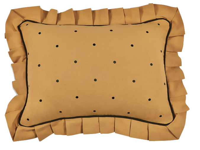
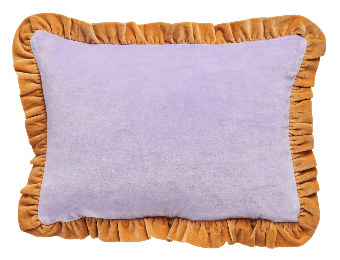
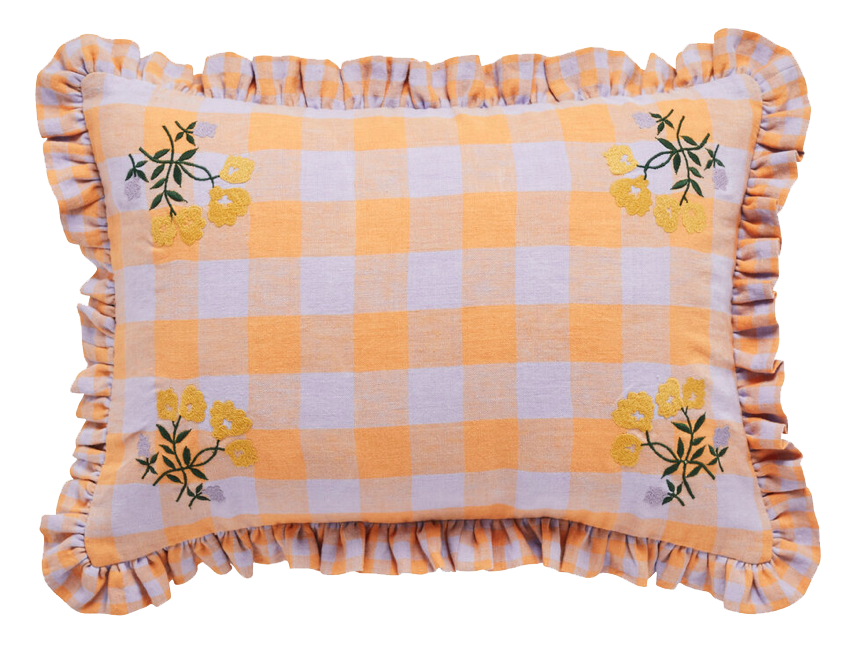
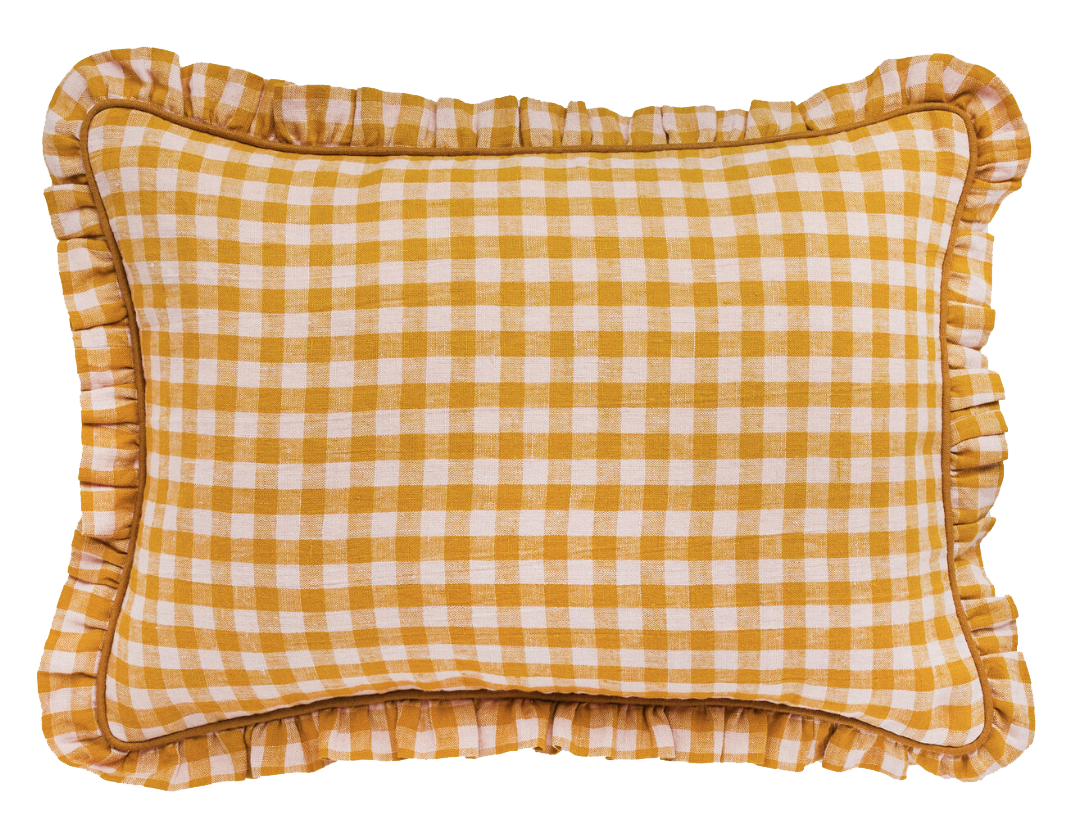
Ceraudo have executed this theme superbly, and are in fact inspired by Italy for their aptly named Dolce Collection. Below are some of my favourite pieces, although I’d happily take them all. I’ve also included in this selection of images items with a strong ruffle, as I am seeing this superfluous edging a lot, and its just so elaborate and joyous. All ruffled cushions, except top left are by Project Tyyny.
Illustrative wall art
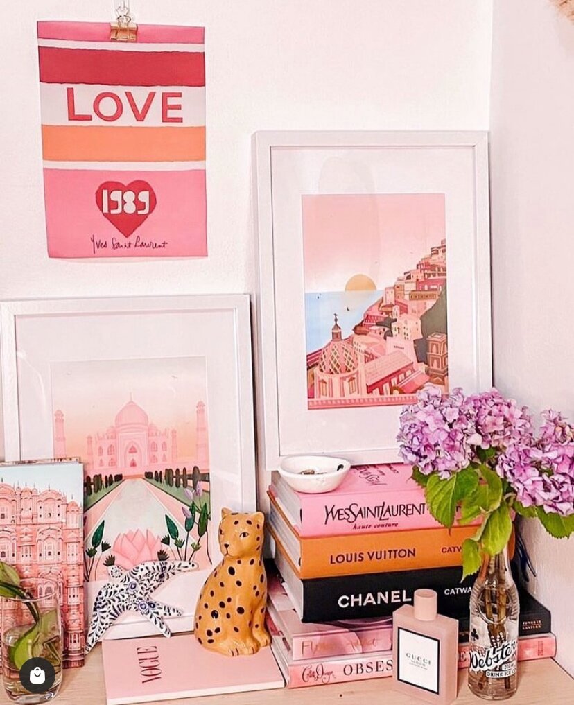
This is more of a micro trend, but very much a thing. Lots of micro-influencers and small brands are using very simple photography in their feeds and on their websites, containing just a few items. The minimal style is then backed with an iconographic print, say, by William Morris, Henri Matisse, Paul Klee and Pablo Picasso -being more of the popular ‘artists’. See below for the kind of thing I’m talking about.
Image by Mattina Moderna - modern, minimal photography with iconographic framed print to boot. (Notice the pillar?)
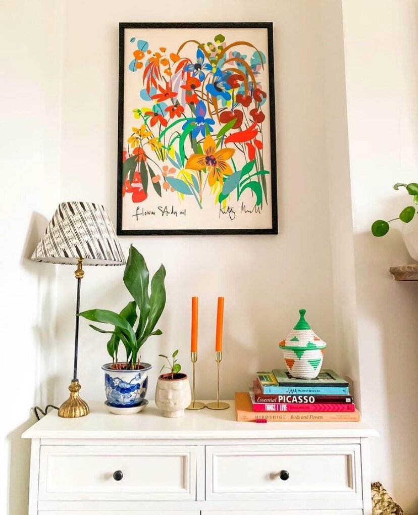
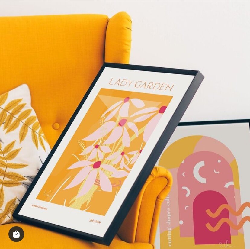
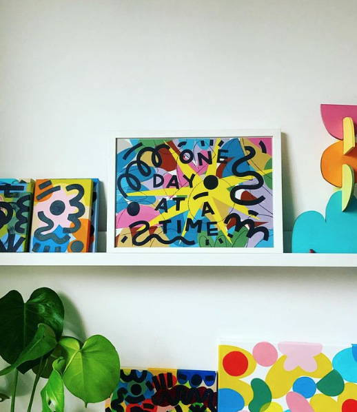
Personally though, I’m looking a little closer to home at local (and UK based) artists and illustrators including; Caroline Dowsett, Eleanor Bowmer (both Manchester gals,) Kitty McCall and Millie Illustrates for my fix. I have a slight obsession with illustrative prints and I have vowed to buy (as much as my bank balance will let me) only from local, and small businesses from now on. You can feel the love, joy and devotion so much more vs. your standard print shops - well, there’s no comparison. Click on some of my favourites below to find out more (and for ease of shopping.)
Of course, there are more trends than what I’ve included in this post but these are the ones that speak to me right now. If you will be applying any of these ideas to your home, I would love to hear which ones and why. Keep your eyes peeled for the next article which will be about ‘emotional trends.’ What’s that I hear you ask? You will find out very soon.


